
In updating an apartment that once belonged to a renowned decorator, Garrow Kedigian adapts, reuses, and recycles with theatrical flair
By Michael Lassell
ELLE DECOR: What was this space like when you first saw it?
Garrow Kedigian: It was great, because my client bought it from designer Jamie Drake. It is a 2,800-square-foot unit that occupies an entire floor of a landmark Beaux Arts building in Manhattan’s Flatiron district. It was originally constructed in 1898 and converted to lofts about a hundred years later. We did leave some of Jamie’s legacy, but my client has very different taste, not quite as bright and colorful as Jamie’s.
ED: What is your client like?
GK: She is a highly energetic, larger-than-life businesswoman and philanthropist with a very European and somewhat bohemian-chic sensibility. She’s very active in the Armenian community. We were introduced by a mutual friend, the designer Michael Aram. We’re all Armenian—as is much of her art.
ED: Did you do a lot of construction in the renovation?
GK: No. My client wanted as little done as possible. Most of the actual work was in the foyer. I installed a screening wall between that space and the main living/dining area, leaving an archway to suggest the enfilade configuration of an old Parisian apartment. Previously, you could look into the whole apartment the minute you stepped off the elevator.
ED: Where did you start?
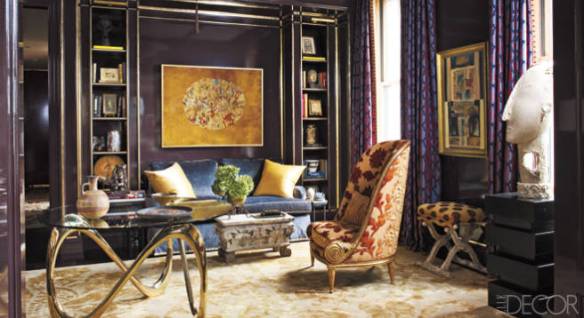
GK: With the foyer. The room serves two functions. First, we wanted to make a visual statement when you first enter the apartment; it sets the tone. The foyer also serves as a library or sitting room, an intimate space my client can use when she’s alone, because the living/dining space—which is perfect for entertaining—is quite large for one person.
ED: How would you describe the aesthetics of the space?
GK: It’s Europe-meets-Asia in mood. We went with a ceiling fixture from Odegard, made from Fortuny silk, which is Old World in feeling, but it hangs above a customized round table with a very contemporary free-form cast-aluminum base in a gold finish.
ED: How about the color of the room? It’s not an obvious first choice.
GK: It’s dramatic. It’s strong and a little different. We decided to keep Jamie Drake’s curtains, which are made from a patterned plum silk of his own design. I treated the whole room—bookcases, moldings, and all—as a single piece of millwork, giving it a high-gloss, dark-eggplant finish. The color was customized from two Benjamin Moore paints after a lot of trial and error. Then I edged the bookcases in gold. You can’t have a room that dark without a little sparkle.
ED: What was your thinking in the radical color change—dark to light—from the foyer to the living area?
GK: There’s a lot of drama in contrast. But the living/dining area, which is L-shaped and has high ceilings, is meant to be a relaxed and social space. The textures change too, from hard and lacquered to soft and plush. But the colors are still earthy and almost neutral.
ED: How did you go about selecting fabrics?
GK: My client liked the softness of cut velvet, as well as the variation in levels of pile. So the Donghia sofas, which I had customized because the feet looked bulky in this space, are upholstered in a classic diamond-pattern velvet. The carpet for the guest bedroom also has a high-pile, low-pile design, which was a reference to the sofa fabric.
ED: What are some of the ways you balanced the contrasts throughout the project?
GK: In addition to the dark and light colors and the textural contrasts, I was very aware of juxtaposing old and new and of softening the strong horizontal and vertical lines of the architecture with round and curved details in the furnishings, like tables and light fixtures. I was going for a layered look with lots of stimulation to keep the eye moving around the rooms.
ED: Is the use of metal a way to keep the space modern?
GK: In part, yes. The legs of the dining table, made of steel with a gold-leaf finish, are a good example. And the Greek key–inspired fabric on the midcentury chairs is both a classical allusion and a modern take on a traditional pattern that picks up the lines of the table. The sideboard is completely contemporary, as is the Elliot Osgood painting nearby, so we added a pair of antique candlesticks to offset the modernity.
ED: What turned out best, in your opinion?
GK: I think the color is the most pleasing to me. It was a struggle to get the tones just right, so that the apartment is equally beautiful in daytime and nighttime lighting conditions. Often when you use strong colors, rooms look better during certain periods of the day, but I think the colors in this apartment have a balancing effect. They work well in both natural and artificial light.
What the Pros Know
• The long wall of the apartment is all windows, and there is little wall space to display the owner’s extensive collection of modern art. So designer Garrow Kedigian hung some pieces in front of the curtains on brass chains suspended from the curtain rods, which allows his client to change the art at will.
• The apartment’s original flooring was maple, a hardwood that is difficult to stain because of its tight grain. But both Kedigian and his client wanted dark floors. The designer added dye to the stain to permeate the wood and give it a deep, even finish.
• To repurpose the existing bedroom curtains in the powder room, Kedigian added crown molding, installing it with a pocket behind it to mask simple rods that hold the silk panels.
Click here to see the gallery for “Drama Lessons.”
This article is from http://www.elledecor.com
(Source: Elle Decor )
